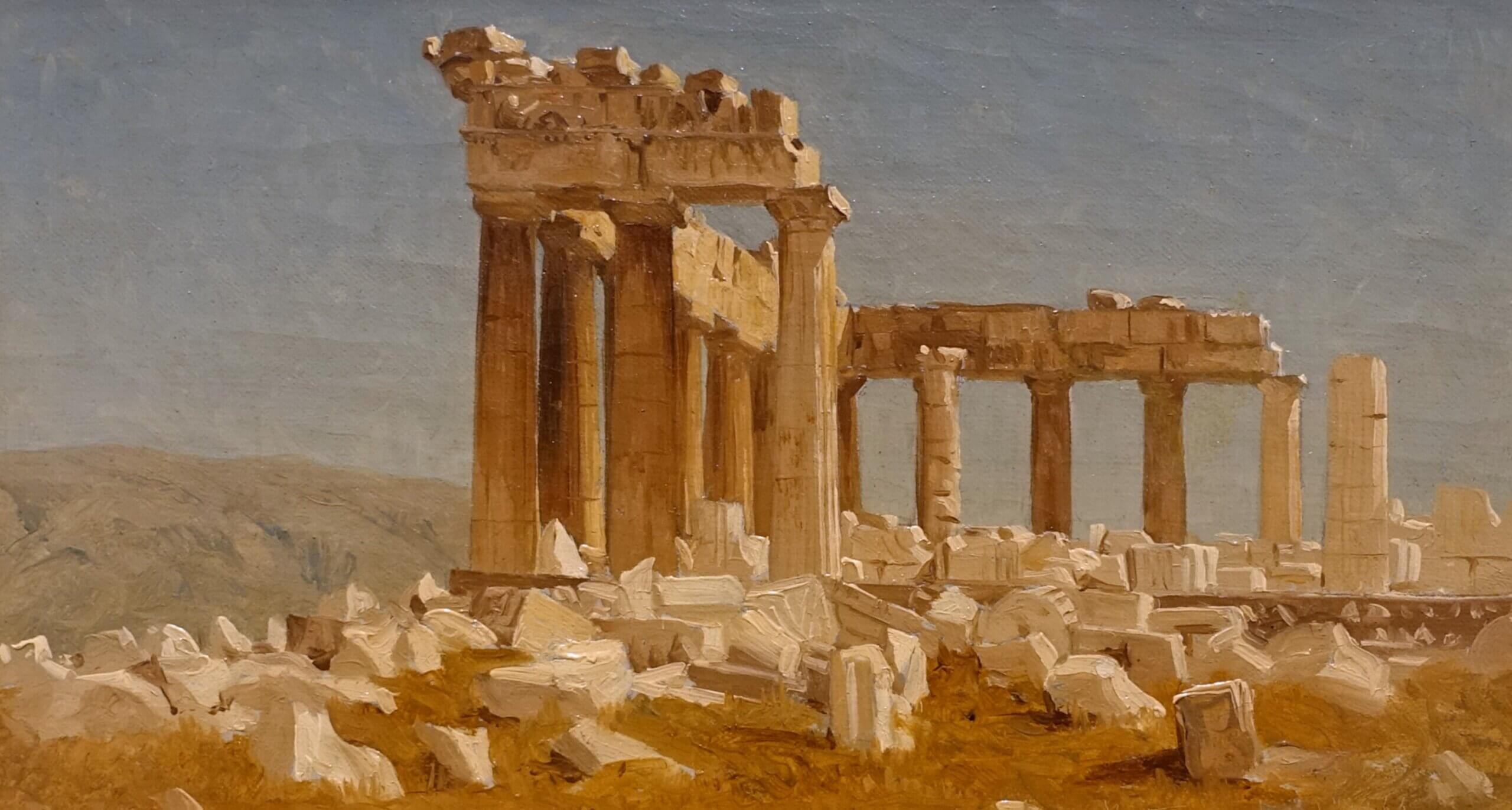
Above: The Parthenon by Sanford Robinson Gifford (1869)
The Art of Dress – Two Schools of Thought
The Art of Dress – Problems with Normalcy
The Art of Dress – Learning from the Valiant Woman
The Art of Dress – What Nuns can Teach Us
In 1925, professors of home economics Harriet and Vetta Goldstein published a textbook called Art in Every Day Life. The book and its three subsequent editions soon become a key reference for virtually all other textbooks on dress of the time and ended up influencing generations of American homemakers.[1]
The sisters began the book with an introduction to “good taste” in their distinctly simple prose:
It has been said that good taste is doing unconsciously the right thing, at the right time, in the right way. Unfortunately, very few people are born with this rare gift, but it is comforting to know that with study one can consciously apply the principles, until the wished for time is reached when the right thing is done unconsciously.[2]
They then presented their formulation of art principles: Harmony, Proportion, Balance, Rhythm, and Emphasis. In subsequent chapters, they covered topics as varied as hat selection, to interior design, to city planning—their principles applied to all.[3]
With occasional references to “the Greeks” and Japanese prints as their authorities, the Goldsteins took for granted in their students a desire for beauty and a willingness to bow to universal principles.[4] Commenting, for instance, on textural harmony, it was enough to say:
In dress we sometimes see textures as inharmonious as gold-lace hats worn with coarse wool sweaters, and strings of pearls with rough wool dresses. The gold-lace hat and pearls are related, and are harmonious in texture with such fabrics as satin, velvet, and fine furs. The wool sweater and the wool dress have textures which would be in harmony with each other and with felt, rough straw, or similar textures.[5]
This clear guidance contrasts drastically from that found in the digital maelstrom of today’s fashion commentary, which seems to value comfort above all and which treats aesthetic value—whatever it asserts that is—only as a means to shock or seduce.
The Goldstein sisters’ challenge to their students to bring beauty to every sphere of life, and their candid avowal that one must follow rules to do so successfully contribute to making their book seem rigid and irrelevant to most intelligentsia today. And yet, among the general population, there are many who, marveling at the beauty of Grace Kelly’s wedding dress, or their own great grandmother’s attire in a faded family photo, begin to suspect that to reclaim some portion of what they admire, it might just be worthwhile to study something with more backbone than the latest vapid fashion blog.
I will now present a brief survey of the Goldsteins’ work regarding the art of dress to show how it might guide us today. I write particularly for women who, struggling to dress modestly, have run up against inevitable frumpiness; who wonder wistfully why even their poorest ancestors looked so much better than they; and who wish to make of dress something more than a dreary duty; in short, who believe that dress can and should be a source of great joy.
Harmony
When people think of harmony, their thoughts likely go first to music. But taken in the broader sense, harmony is merely the successful arrangement of things, be they musical notes, buildings, or bracelets; harmony and disharmony occur in all realms of art.
The Goldsteins described harmony as, “the art principle which produces an impression of unity through the selection and arrangement of consistent objects and ideas.”[6] They described harmonious objects and ideas as having “family resemblances” and “friendly” relationships with one another, and broke harmony into four sub-categories: shape, texture, idea, and color.[7]
Shape Harmony
Regarding shape harmony in dress, they wrote:
Since a dress design in itself is not considered as a complete unit, but as something to be worn on a human figure, its lines should suggest some relationship to the lines of the figure. This means that its outline will follow the form closely enough to have something in common with it, yet not so closely as to appear immodest or to be uncomfortable.[8]
One finds here a refreshingly balanced perspective of the “shape” question so often considered only from the view of how much ought to be hidden. A human wears the clothes; therefore, it is proper and logical to show some suggestion of the human shape rather than to obscure it completely in the name of modesty. In warning against the other extreme, that is overly clingy clothing, the Goldsteins assume their readers not only know what modesty is but also desire it. Not prone to philosophizing or preaching, perhaps they found the admonishment to ease of motion an easier one to support. Besides, in their day, stretch fabrics had not yet made second-skin leggings and tank tops a possibility, so anyone looking for ease of motion would have necessarily worn looser fitting clothing. In the section on emphasis, I will further discuss the problems with overly clingy clothing.
To further understand shape harmony, consider the photos below:
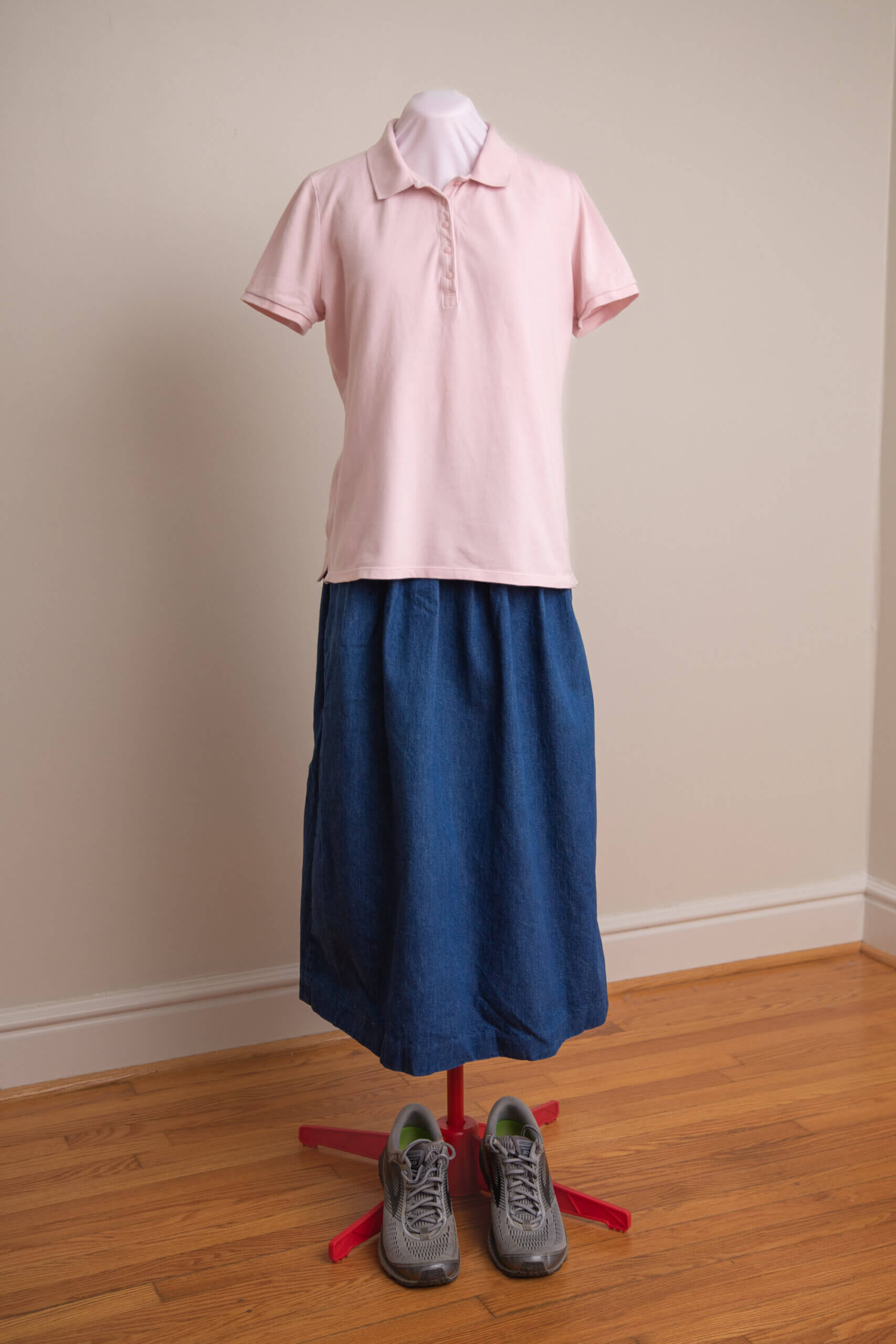
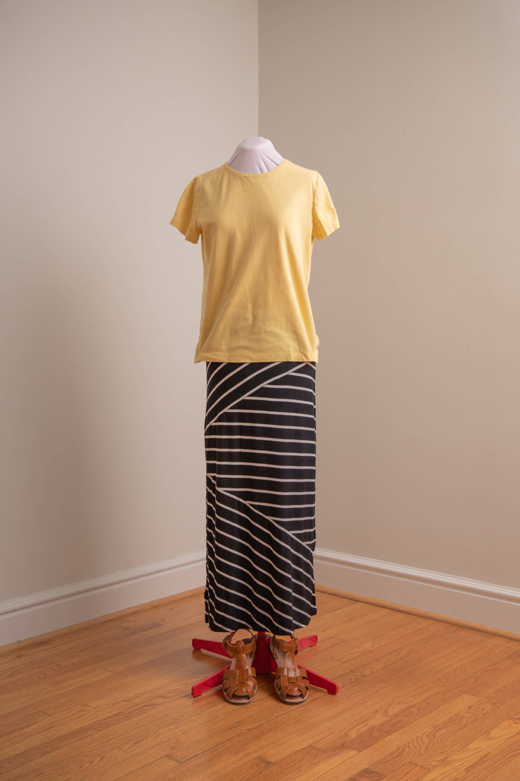
Although this ensemble succeeds in decently covering the wearer, it shows very little shape harmony. The baggy untucked polo shirt obscures the figure beneath. The skirt fails to fall gracefully over the hips and instead seems to hang midair in a stiff wad. The shoes do not allow the figure to “taper” at the feet, but rather, stand out like two heavy blobs. This ensemble, though less than ideal, could be greatly improved simply by tucking in the shirt (assuming the skirt sits at the natural waist) and exchanging the sneakers for light flats or sandals.
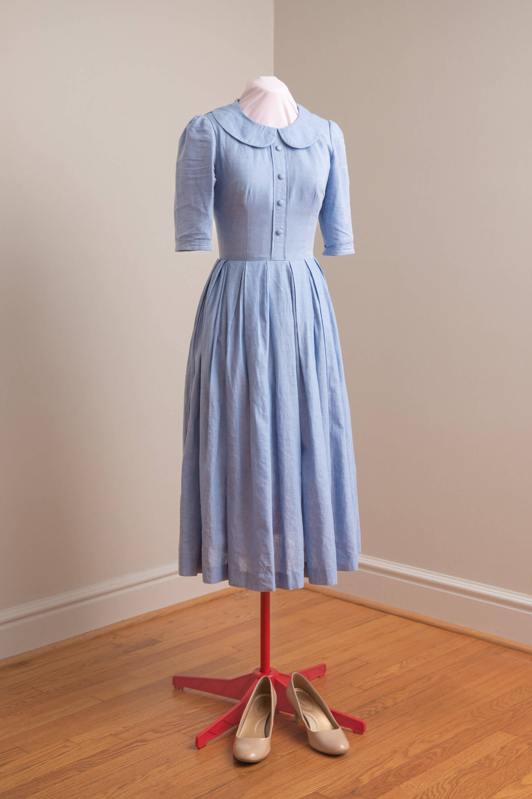
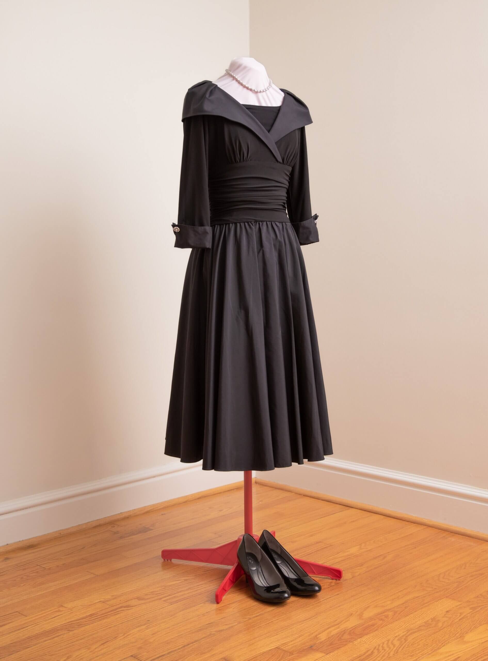
This dress also succeeds in decently covering the wearer, but this time, shows successful shape harmony too. The bodice, though fitted, does not cling. Its seam at the natural waist harmonizes perfectly with the wearer beneath. The ordered gathers of the skirt fall gracefully over the hips, at once concealing and revealing the beauty of the figure. It is worth noting too, that the gentle puffs at the shoulders provide ease of motion remarkable for a fabric (a cotton linen blend) with no stretch. The length of the sleeves and their narrowing width down to the elbow harmonizes better with the arm of the wearer than the untapered quarter-length sleeves of the standard polo shirt above.
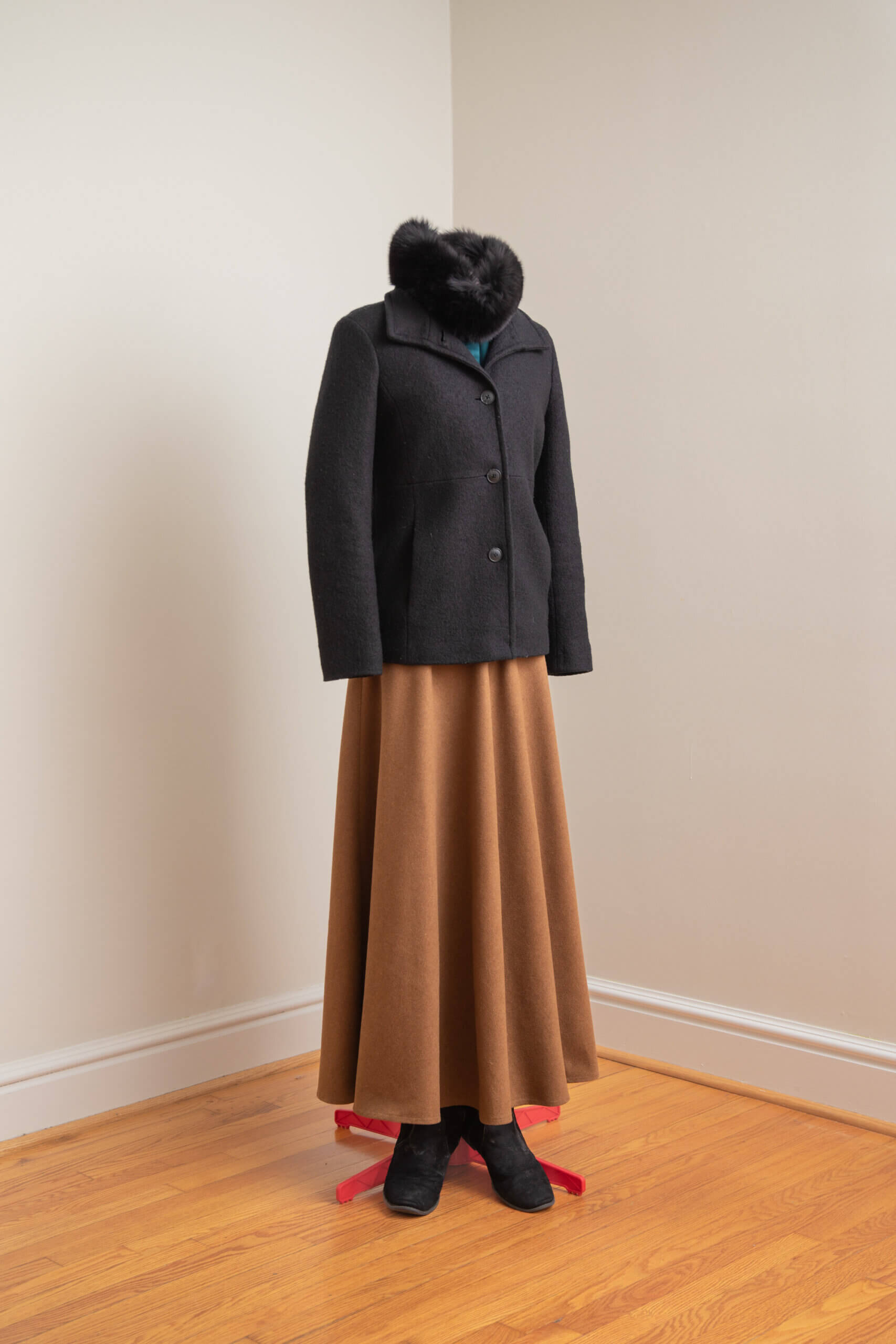
Textural Harmony
On harmony of textures, the Goldsteins unlock a great secret to artistic success: namely, that materials exist in roughly three textural families—coarse, fine, and transitional—and that to achieve harmony in a design, all materials used must originate (or seem to originate) from the same family. For instance, the common durability and weight of denim, rough wool, and leathers such as rawhide makes them siblings. Just as one expects to see the brothers and sisters of a family together, so it appears natural for related materials to comprise an ensemble of clothing. In the realm of fine materials, the similar luster of pearls and satin makes them like two radiant sisters, and one could call fine lace their cheerful cousin. Straw and light fabrics such as muslin and linen share a common summer airiness. And so on. It is beyond the scope of this survey to determine what generates family relationships of materials—are they only a human association, or something metaphysical? Here it suffices to repeat the Goldsteins’ simple statement:
So many schemes just miss being successful because the person who planned them did not recognize that textures which are very coarse have nothing in common with those which are very fine.[9]
Ironically, most adherents of “mainstream” fashion accidentally achieve textural harmony simply because they never attempt anything beyond the most informal level of dress. Their T-shirts, yoga pants, and running shoes, all fall in the same family of textures. This perpetual informality of the so-called “athleisure” style presents its own set of problems.
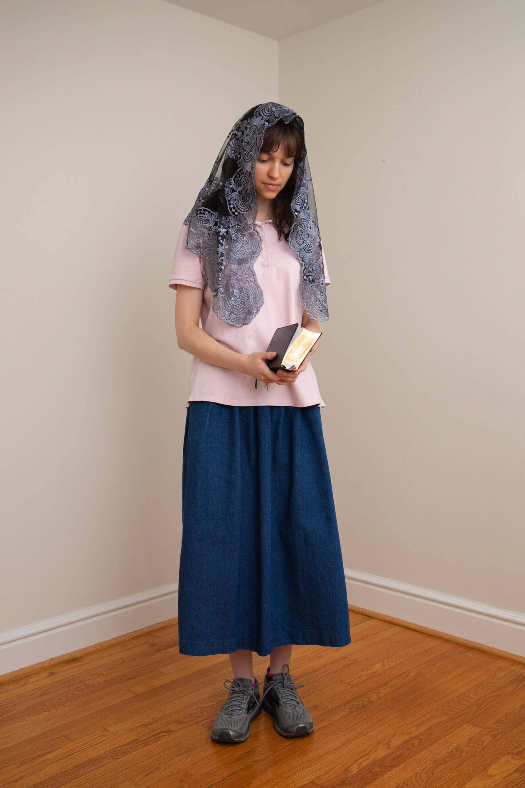
However, among devout Catholics who sometimes try to dress with formality one often sees instances of these texture schemes that “just miss.” For instance, the woman who pairs a light chiffon dress with a boxy unisex windbreaker. The utilitarian “sport” fabric and masculine shape of the one has nothing in common with the light fabric and femininity of the other. Nor do the shock-absorbing foam soles and neon mesh of sneakers have anything in common with a light cotton sundress. And, perhaps the most ubiquitous and well-meant blunder of all: fine lace chapel veils have nothing in common with denim. Although most lace seen today is made of nylon and produced by machines (and therefore inexpensive), lace as a fabric family still enjoys an aura of great formality, even regality. Historically lace was considered a precious fabric and counted as part of a kingdom’s treasure. It will always clash with utility fabrics. Nor does it correct matters in the least to tie the chapel veil around the head “dew rag” style as one sometimes sees.
To further understand textural harmony, consider the photos below:
In the Goldsteins’ day, occurrences of disharmony were still largely the result of innocent artistic blunders and limitations in resources, as is the case among devout Catholics today.
But in contemporary mainstream fashion, we see highly trained designers purposely generating ridiculous combinations such as combat boots paired with evening gowns or jeans with patent leather heels, and flaunting them before all the world. The forces which drive contemporary fashion come from a philosophy which dislikes beauty and therefore have no use for harmony. They call their creations “edgy,” “fierce,” or “tough,” but these are meaningless labels used simply to glamorize ugliness.[10]
Idea Harmony
Art in Every Day Life introduces the important concept of idea harmony. “It is not enough that sizes, shapes, colors, and textures should have something in common,” the Goldsteins write, “but there must be harmony in the ideas which are presented together.”[11]
An ensemble of clothing may convey many ideas: the age of the wearer, the wearer’s state in life, the wearer’s present occupation, the time of year, etc. The more the ideas conveyed by an ensemble harmonize with one another, their wearer, and their surroundings, the more beauty the ensemble can achieve.
The light summer fabrics and brilliant colors (or dazzling whites) historically worn by those in tropical climates harmonize perfectly with their surroundings. They seem to have grown out of their surroundings as a harmonious synthesis of nature’s inspiration and human craft. On the other hand, the rich earth tones or warm jewel tones of fabrics historically used in colder climates harmonize well with the quiet sobriety of winter’s ethos. A dress of flounces and polka dots clashes with the venerable dignity on an elderly woman but harmonizes well with the playful spirit of a child. Conversely, black lace and dark heavy fabrics harmonize far better with a matron than a little girl. Formal clothing cut in more restrictive styles and made of fine fabrics does not harmonize with occupations such as hiking or farming which suggest ease of motion and a kind of pragmatic kinship with the elements. On the other hand, the garb of hiking and farming does not harmonize with ceremonies of high splendor such as liturgies, which point to things high above the mundane. These greatest occasions of life demand formal clothing in order to harmonize with the decorum and majesty of the prevailing atmosphere which has momentarily set aside life’s various labors to bask in the divine.
One of the most common disharmonies found in the dress of devout Catholics comes from the disregard for seasonal dress. Velvet appears in July and hibiscus prints in January. The many devout women who amass collections of maxi skirts, those long polyester tubes of striped or figured polyester, seem not to realize that the flimsy fabric and invariably garish summer prints will never look well with Eskimo boots.
Admittedly, wool and other winter-weight fabrics have become nearly impossible to obtain. Year-round, one can hardly find anything but thin, stretch polyester in loud prints. Nevertheless, the fact remains that the clash of ideas—summer and winter—creates disharmony. It is worth noting too that the change of seasons and the movements of the natural world in general have a profound impact on man’s spirit. Dressing with a true consciousness of the seasons is a fundamental way to counteract forces which, through technology, seek to disconnect man from the natural world and the image of God therein.
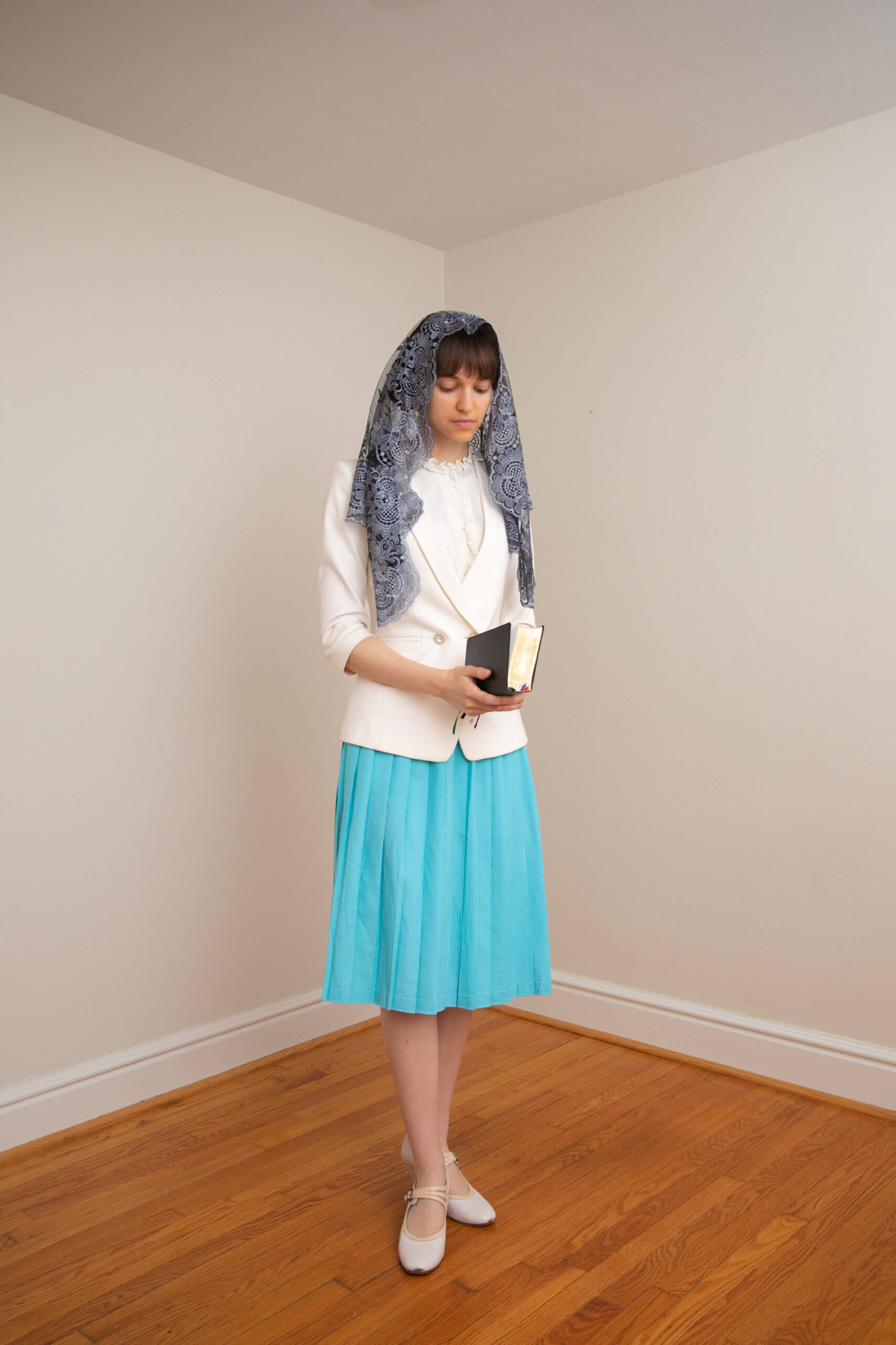
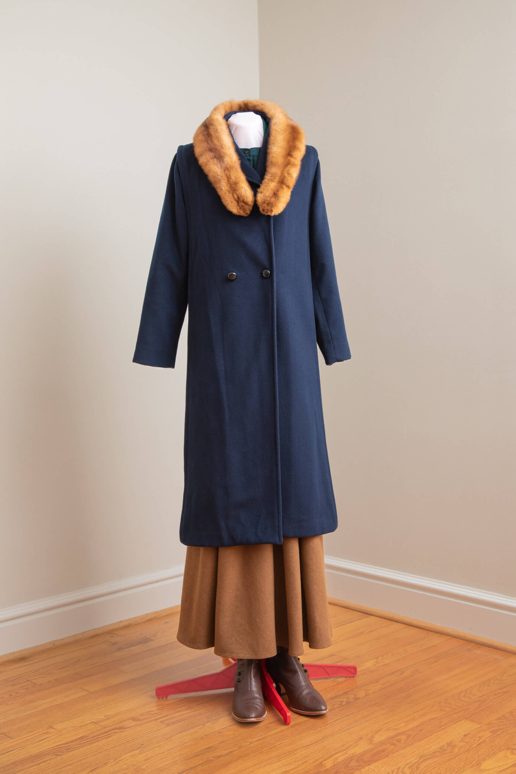
To further understand idea harmony, consider the photos below:
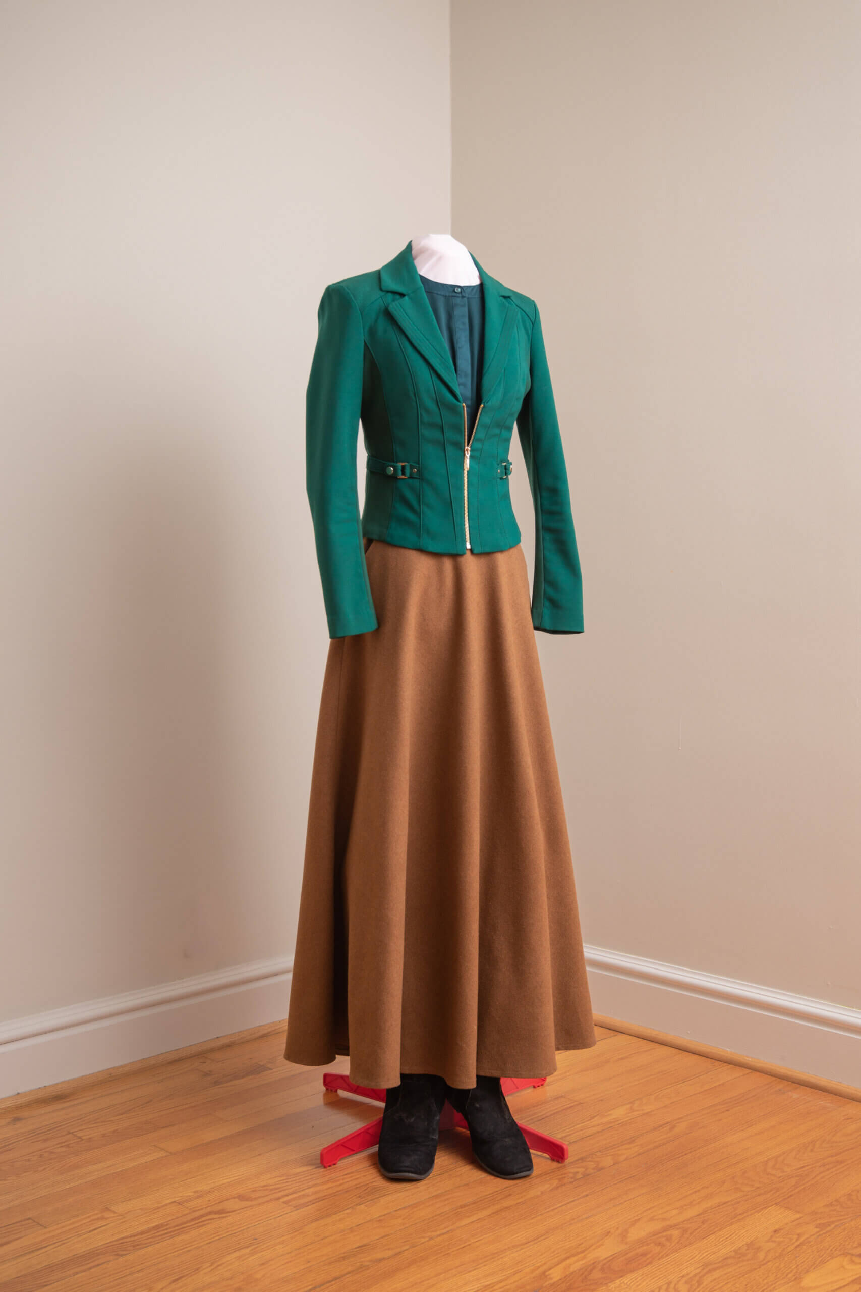
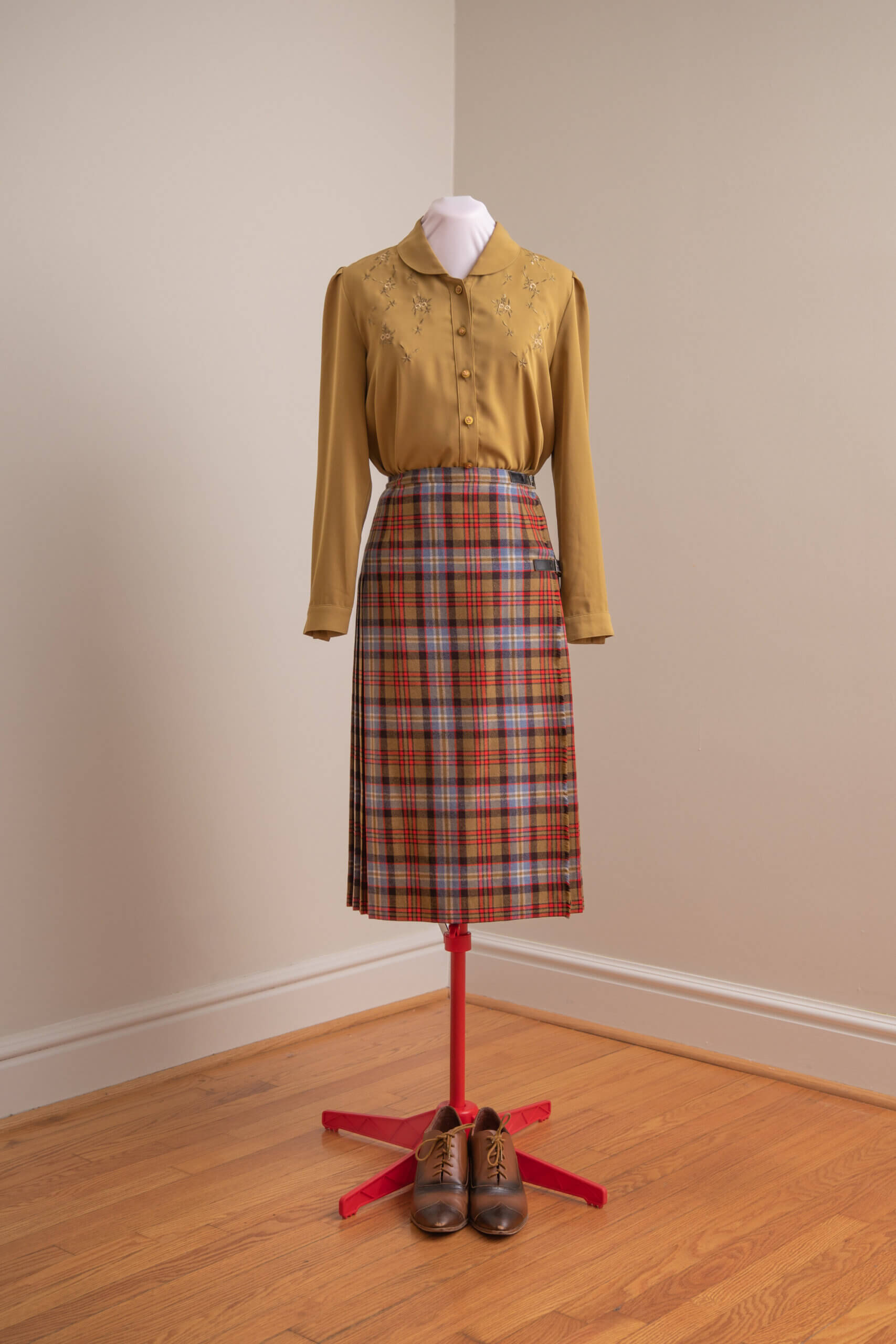
This hunter green jacket and heavy wool skirt convey an autumnal idea that harmonizes well with the boots.
Before concluding this discussion of idea harmony, one crucial point must be made. Although, harmony with one’s surroundings can very often result in great beauty, in the post-modern world, one usually must draw a line of distinction as a kind of aesthetical pale that divides ordered beauty from the disordered chaos which surrounds us. For instance, a woman who must work every day in a brutalist office building must not strive to harmonize with this ugliness. She must recognize that the architecture, furniture, and likely the dress of all those around her flows from an ideology which has rejected harmony and beauty. By dressing beautifully, she will be a light in the darkness.
Color Harmony
The fact that the Goldstein sisters devoted two full chapters to an in-depth treatment of color theory in itself speaks of their conservative approach to art. “In order to understand color and use it beautifully,” they wrote, “it is necessary to learn enough color theory to understand color language and to know why one should choose certain colors rather than others.”[12] They then go on to present both the Prang and Munsell color systems.
While it is beyond my scope to retrace their steps here, for dress, it is safe to say that the rules of traditional color theory apply with the interesting additional challenge that the human person represents not a blank white canvas but a complete work of art already. When dressing, one must consider how the colors of man’s art (dress) play with those of God’s art (the human complexion).
To further understand color harmony, consider the photos below:
This ensemble possesses colors which are not inharmonious. Camel brown is light enough to pair with black without resulting in the discord one usually finds in black and brown combinations.
However, with some knowledge of color theory, one may see that camel brown is really a shade of orange; a quick glance at the color wheel and one sees that to complement orange, one must use blue. The trick is finding a blue with the same value (lightness or darkness) and intensity (level of neutrality). Here a navy blue suffices.
This is the classic navy blue and brown combination often exhibited by men who wear navy blue suits with brown shoes and belts. The human eye delights in this pairing. There are many other successful color schemes which one may easily determine with some knowledge of color theory.
Proportion
Many Thomists will view proportion and harmony as overlapping if not synonymous principles. The Goldsteins themselves wrote that proportion is “the Law of Relationships,” a definition hardly distinguishable from their words on harmony. But as the sisters continue unfurling their elegant prose, one soon sees that what they mean by proportion is a more specialized treatment of shape harmony.[13]
The Goldsteins’ treatment of proportion stems from a simple understanding of the human mind’s tendency to assess rapidly and subsequently dismiss monotonous patterns such as the spacing on a picket fence, but to linger on unusual patterns such as a gate or archway. Their example par excellence from which they build their entire pedagogy of proportion is the Greek Parthenon and its proportions of roughly two-to-three.
The Goldsteins dismiss one-to-one ratios such as those seen in the drop-waist frocks of the flappers as “mechanical,” “uninteresting,” and “commonplace.”[14] They provide detailed analysis of human proportions as measured by head-lengths, and point out that women ought to remember that “fashion figures” are often drawn as nine, ten, or eleven heads in height, when the average woman is only seven and a half heads tall. The sisters remind their students that harmonious proportions in dress must always begin with an understanding of the proportions and size of each individual. For instance, a broad woman ought to avoid wide horizontal stripes, as they will tend to make her appear overly broad and distract from her other features. A very petite woman ought to avoid oversized prints. Flowers ought never be bigger than the wearer’s own head!
To further understand the principle of Proportion, consider the photos below:
Although the Goldsteins spoke often of the “normal” and “average” figures with regard to height, and provided much practical guidance for dressing the “stout” figure, they never mention dress of the pregnant woman.[15] This can be attributed to the times in which they wrote.
However, given their focus on health and ease of motion, one can well imagine the Goldsteins took the pregnant figure in stride. To the woman of “Large waist and Hips,” they recommend building out the shoulders, keeping the center of interest at the face, wearing skirts long to add height, and selecting hats of slightly larger than average size.[16]
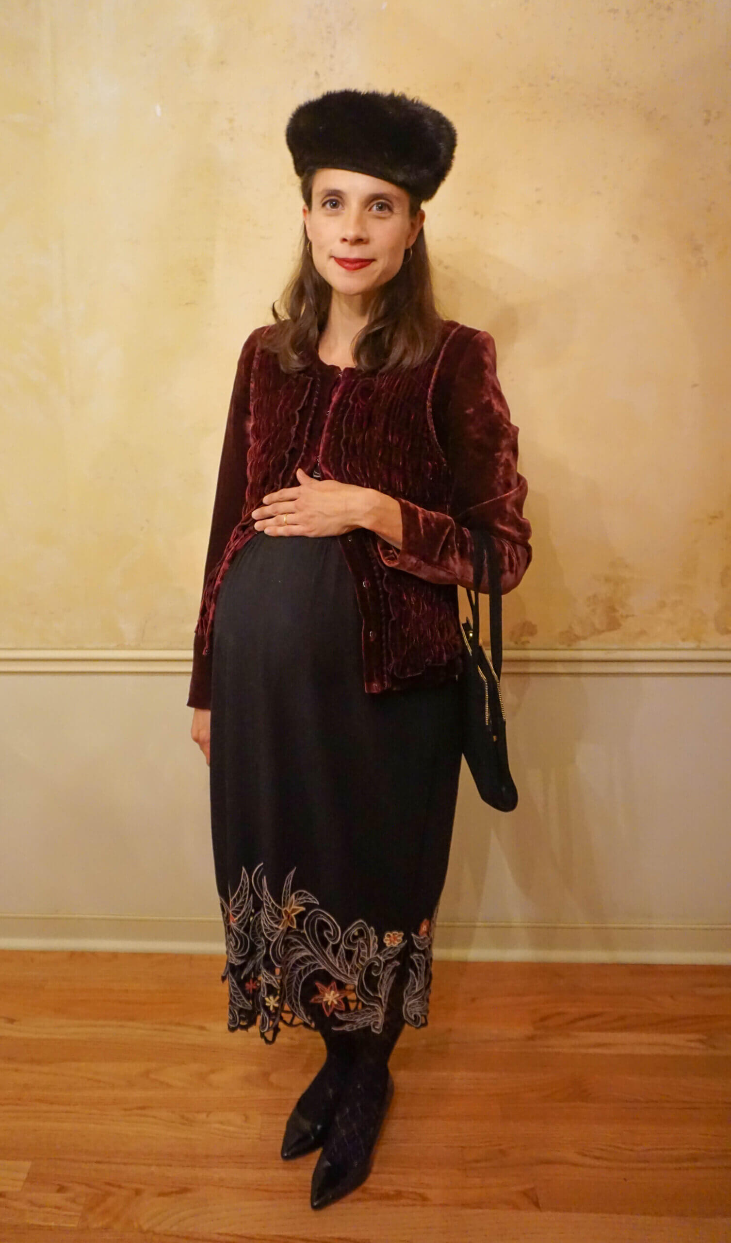
The model in the image above is thirty-eight weeks pregnant. The structure and detailed stitching of her velvet jacket lend width to her shoulders and her fur hat echoes the black of her dress while drawing the eye to her face. This is not an attempt to hide pregnancy, but rather, a way of dressing which protects the mother’s sense of modesty and helps the viewer see the mother as a whole person. Where her pregnancy draws much attention to her body, simple techniques of dress can help draw the eye back to her face, the window of her soul.
Balance
The Goldsteins defined balance as a restful effect obtained by grouping shapes and colors around a center in a way that creates equality of attractions on each side of that center. They wrote,
One does not enjoy watching a woman in the street if she is wearing a wide hat and large furs, with a short tight skirt and French heels; she looks so top-heavy that it seems as if the next gust of wind would blow her over.[17]
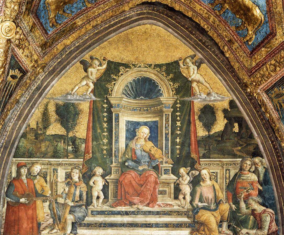
They then launch into a practical overview of how weights (sizes and colors) must balance a work of art across right and left and top and bottom. The Goldsteins used Pinturicchio’s Music as an example of “Formal Balance” which occurs in symmetrical compositions:
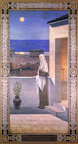
And they used Puvis de Chavannes’ Saint Genevieve Watching Over Paris to illustrate for their students, “Informal Balance” where the composition is not symmetrical, but balanced by skilled spacing of objects and varied depths of color.
One can achieve formal balance in dress more easily than informal balance because the human figure lends itself so well to symmetry: the figure has two arms, so two sleeves make good sense. The figure has width at the bust and at the hips, so flares in the fabric at both places balance each other perfectly.
A lady may achieve informal balance with such “tricks” as a corsage on her right shoulder and a large bracelet on her left hand or a scarf hung over her right side and a hat tilted to the left, but seeking more prominent asymmetry usually ends in failure.
Modern designers often discard symmetry without any attempt at achieving beauty through informal balance. They make one-shoulder dresses or jagged skirt hems that hang ridiculously longer on one side without any element on the other side of the composition to restore balance. One recent example is the wedding gown of Rajwa Alseif which was largely symmetrical except for a neckline which veered sharply toward her right shoulder. Not only did the neckline create a harsh, ugly shape, the bride had nothing on her left side to balance it. Instead of marveling at the beauty of the bride’s overall dress, one gets stuck pondering the question why she had to have a slanting pizza slice cut out of her neckline.
The most common violation of balance seen among devout Catholics is the use of heavy shoes paired with skirts that hit right at mid-calf making the figure bottom heavy.
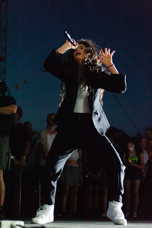
While this cloddish style is of course unintentional among those of faith, it is celebrated by the destructive forces of popular culture which drive mainstream fashion into ever greater ugliness:
Contrast the above example with the ensemble below which shows perfect balance and feminine grace:
Rhythm
The Goldstein sisters defined rhythm as the “easy, connected path along which the eye may travel in any arrangement of lines, colors, objects, or lights and darks.”[18] In order to possess true rhythm, a work of art must allow the eyes this “ease” of movement which provides a sense of rest. Aquinas tells us that happiness is “rest in a good attained” (I-II q4 a1). The good attained from rhythm is the same as the good attained from any of the art principles, namely, the beauty of form. In other words, rhythm takes its part in bringing to bear the form (or the truth) through movement. Meaningless lines, chaotic patterns, and inharmonious combinations of textures and colors lack rhythm.
To further understand the principle of Rhythm, consider the photos below:
The figure above shows an ensemble lacking rhythm. The eye does not rest but rather throbs in the repetition of thin light and dark stripes over such a large area, and the arrangement of these stripes in a large zigzag do not bring to bear a beautiful form, but seem at odds with the wearer’s form, as if she had been slashed to pieces and reassembled incorrectly. The clashing yellow T-shirt creating yet another meaningless line at the hips only adds to the overall effect of chaos, and the straps of the sandals bring in another unrelated scheme.
This figure, on the other hand, shows lines that form an orderly pattern over the wearer’s legs. The use of horizontal lines adds interest, but the predominant motion is vertical, which highlights the upright posture of the human form. The color palette is more complex than that in the figure which lacks rhythm, and yet the eye moves from one color to the next easily, as one moves from one word to the next in a well-metered poem.
Emphasis
The Goldsteins define Emphasis as “the art principle by which the eye is carried first to the most important thing in any arrangement, and from that point to every other detail in the order of importance.” The sisters highlight the importance of simplicity in a design, of having a clear center of interest which may or may not have secondary points of interest around it. “The eye and the mind do not enjoy a haphazard collection of shapes and colors,” they state.[19] And lest their students mistake this tenet as a call to empty monotony, the Goldsteins present Hubert and Jan van Eyck’s Adoration of the Lamb as a composition far from minimalistic, but possessing an unmistakable center and logical secondary points of interest:

To help their students bring about successful emphasis in their own compositions, the Goldsteins exhorted them to carefully consider the following questions:
- What to emphasize.
- How to emphasize.
- How much to emphasize.
- Where to place emphasis.[20]
They then discuss each of these questions at length and provide insights on grouping of elements, contrasting lights and darks, ornamentation, judging the correct ratio of background space, and the use of unusual or unexpected lines, shapes, sizes, and colors. Emphasis, in comparison to the other art principles, demands subtle artistic judgement. Where the other principles seem almost binary—e.g. one achieves harmony or disharmony, balance or imbalance, and so on—emphasis exists on a more gradual scale and has the added complexity that one may very successfully emphasize the wrong thing.
Modern clothing designers have become masters of the principle of emphasis, but they choose to emphasize what ought actually to be veiled. Deep V-necks, “window shirts,” and “cold shoulder shirts” draw the eye to cleavage or reveal patches of flesh with the sole purpose of drawing the mind to the idea of still more naked flesh. Great slits in the skirts of evening gowns point like arrows at the body beneath as if to apologize to the lusting viewer for such a troublesome excess of fabric. All but the baggiest women’s blue jeans are designed to draw the eyes to the wearer’s buttocks.[21] And finally, yoga pants and clinging T-shirts adhere to every curve like the casing of a sausage, making the human within appear like only so much meat.
The Goldstein sisters had a different approach to emphasis. They wrote, “In the well-organized plan for a costume the face will be the chief center of interest; the most successful design is that which will lead the eye to the face through the choice and arrangement of all the colors and lines that go to make up a dress design.”[22] And elsewhere, “Here the person is the chief center of interest, and the clothes are the background.”[23] This, however, does not mean that clothing must be bland or have no points of interest of its own. The sisters explain how Bronzino’s Portrait of Lucrezia Panciatchi centers the viewer’s interest on her face by way of an ornate neckline echoed at her waist with a jeweled belt. The eyes then fall to her beautiful hands which are emphasized both by the contrast of dark fabric and light flesh and the delicate ruffles of her cuffs. Her exposed neck and hands do not distract from her face, but rather complement it, and she sits before the viewer as a truly whole person:[24]

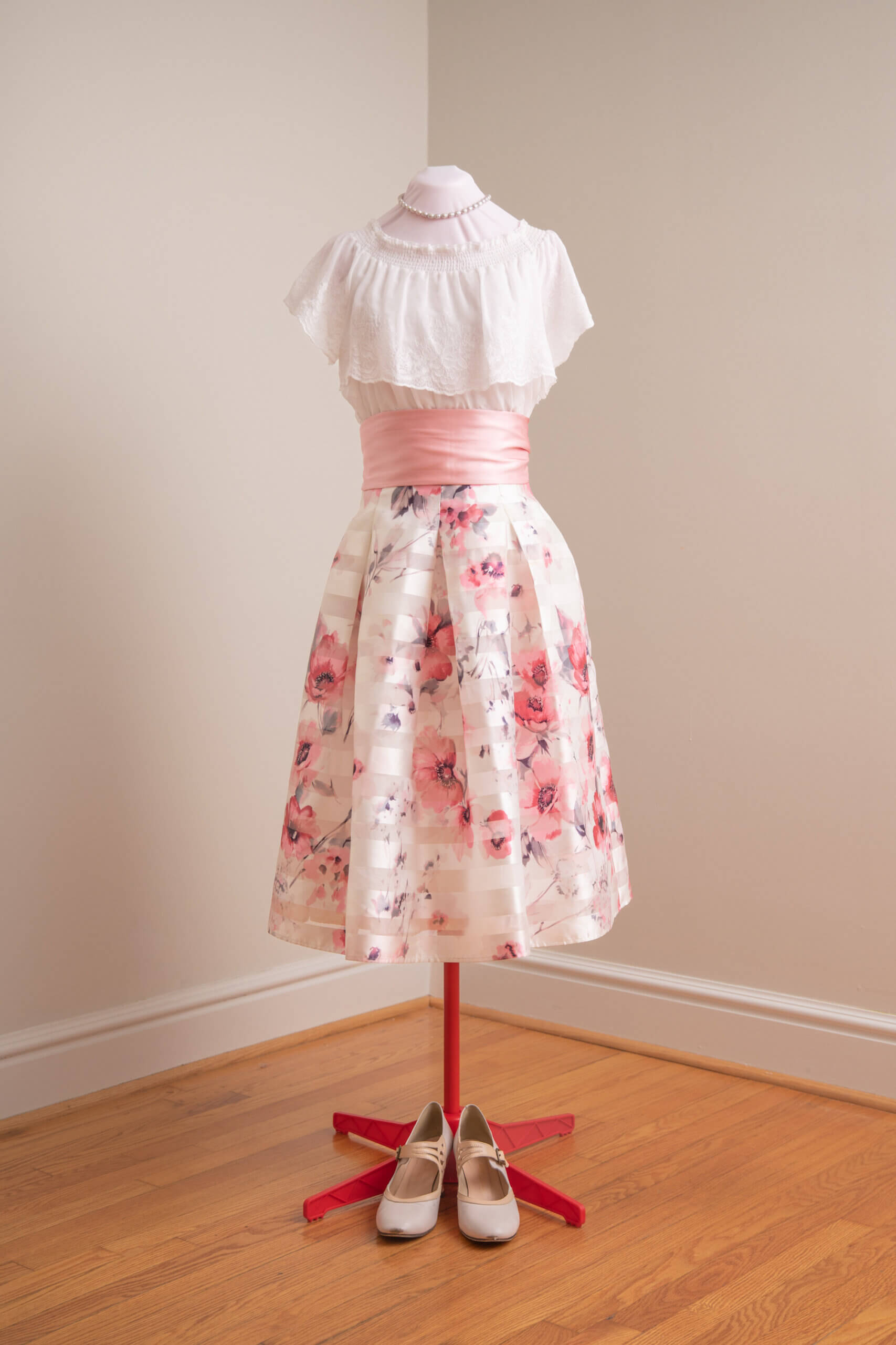
In dress, there exist many possible secondary points of interest, but in general, any feature not overtly sexual may add to the beauty of the whole without leading to lust. For instance, a woman may show the beauty of her collar bones with a neckline cut just a little beneath them; this, rather than drawing the eye down in the way of a deep V-neck, draws the eye back up to the face by framing it. Or, a woman may wear an ornamented belt that divides her figure in pleasing proportion without revealing every curve.
The photo below shows a contemporary example of an ensemble where the neckline (highlighted by pearls) and the waist (highlighted by a sash) add interest, but exist only as parts of the whole and will emphasize rather than distract from the wearer’s face.
In Conclusion
Writing in the wake of World War I, the Goldsteins would have noticed early signs of cultural decay all around them, yet their book betrays no alarm. For better or worse, they did not fill their pages with laments and admonishments, only with calm common-place instruction. Nor did they consider the application of art principles an act of restoration but merely an act of “good taste.” Though they admitted that dressing well requires study and care, they never went so far as to say that it requires courage and perseverance.
But for us today, the art principles call for a more intentional and whole-hearted adoption. Whereas in the Goldsteins’ day, art principles acted as guidelines to help consumers make selections in the market’s plethora of readily available options, they now act as beacons in a cultural wasteland where options are few and far between.
Nevertheless, causes for hope abound. For one thing, the principles themselves are as simple as ever; merely by thinking about them as she selects her daily clothing, a woman will begin to discover how she might improve her dress. She need not transform her entire wardrobe overnight; it is enough to begin with just one ensemble. For another thing, the increase of small online boutiques and resources for seamstresses has allowed woman to break free from the tyranny of the shopping mall and superstore’s limited offerings. And finally, readers will find that the beauty they achieve as they apply the art principles becomes a real source of nourishment to themselves and those around them. This nourishment will help them continue on with the quest to still more beauty. By practicing dress as a joyful art rather than a dreary duty, they show the world a view of higher things, of the life of the soul, and even of Heaven itself.
Five Ways to Begin Applying the Art Principles Now
- Begin with Solemn Mass. Consider the clothing you usually wear to Solemn Mass and start by perfecting just one ensemble. Do the elements harmonize with the shape of your body? Your age? Personality? The color of your skin and hair? Do the elements bear a family relationship with each other? Are there elements of denim or rustic leather that could be replaced with something more suitable for a solemn liturgy? (One question that can often help: would I wear this to a wedding?) Do the ensemble’s rhythms provide rest to the eyes? Would a hat or graceful shawl improve the ensemble’s balance? Does the ensemble emphasize that which should be veiled? Would a belt, sash, or necklace add an interesting secondary point of emphasis?
- Enjoy dress every day. Even if one dresses for messy housework or errands, one can still enjoy practicing the art principles. An old baggy dress from a thrift store can receive new shape with the use of a belt. A festive cotton scarf that harmonizes with skirt and blouse can hold back hair. Aprons of all shapes and sizes can take much of the risk out of working in “nicer” clothing. Few tasks besides mucking stalls and painting rooms are so messy that even a full-body apron will not suffice to protect one’s ensemble.
- Opt for quality over quantity. Rather than filling your closet with scores of polyester dresses of a generic one-size-fits-most design, save your funds to buy one dress or skirt of cotton, linen, or wool from an online vendor such as eShakti or XiaoLizi which provide customization options to suit your size, shape, and personal taste.
- Be patient. It took you time (probably years) to build your current wardrobe. Do not try to overturn it in one day. Work with what you have as best you can and be selective with new purchases.
- Remember for Whom you dress. The whole point of dressing beautifully is to draw your mind and heart to God. If ever the difficulty of practicing the art of dress begins to discourage you, remember to offer your efforts to Christ Who clothes the lilies of the field.
With the exception of the photo from Erin Werner, all other photos not linked to their public domain source are courtesy of Cameron McCarty and private property of Anna Kalinowska.
(c) 2023 Anna Kalinowska. All Rights Reserved.
[1] Linda Przybyszewski, The Lost Art of Dress. (New York, New York: Basic Books a member of Perseus Books Group, 2014) 17 – 18.
[2] Harriet and Vetta Goldstein, Art in Every Day Life. (New York, New York: The MacMillan Company, 2030) 3.
[4] The Lost Art of Dress, 65-66 and 53 and Art in Every Day Life chapter 4.
[5] Art in Every Day Life, 49.
[10] Alexis Frawley and Jessica Glass, “Edgy Style: Fierce Fashion Tips to Level-Up Your Looks” Stitch Fix, 14 June 2022.
[11] Art in Every Day Life, 49.
[18] Art in Every Day Life, 115.
[21] Stacy London, “Stylist Stacy London Says Skinny Jeans Will Never Die—Here’s Why” Rachel Ray Show, 2021. In this video tutorial on denim selection, stylist Stacy London, tells viewers, “The most important thing to know about denim is that if it doesn’t make your butt look good, you’re wearing the wrong shape.”