Some of you may have noticed that posting has been light since Thursday of last week. I wanted to fill you in on the reason why.
I’ve been working on finding the right look and feel to keep 1P5 as readable and accessible as possible, and I’ve been heavily invested in the technical aspects of getting that done over the weekend. We’ve gotten countless compliments on our visual appeal over the past two years – a light and bright design with lots of clear and attractive images that makes the site enjoyable to look at…which is kind of important when you’re spending time reading something.
But I’ve also had complaints about readability, particularly from some of our readers with impaired vision. The design originally had text in shades of gray, which were hard for some people to make out. We’ve darkened them, but the links are still hard to see, and in general the text is somewhat smaller than the emerging standard for readability.
I also think the site has become far too busy, especially on the homepage. Between the sidebar with its various ads and info boxes, and the section breakdowns on the front page along with the auto-scrolling slider, there’s a lot going on when you hit our homepage. Some of the sections – like the featured videos, Catholic Voices, and the links to other news articles and blogs, just aren’t getting updated as regularly as I had originally envisioned. This leaves us with a lot of essentially dead space – clutter that becomes superfluous to the reader in finding what he wants. It’s also difficult for many people to find archived content, and with well over a thousand articles here, that’s simply unacceptable.
In other words: our best and most shared content is getting lost in everything else that’s going on. I’m going to put it right back where it belongs, front and center, and I’m going to remove anything that distracts from that.
I’m working on a design that is clean and readable: larger, darker fonts, less visual distraction, and better responsive design — that’s the term web geeks use for “does it look good it on a phone or tablet?” I was looking at our September stats, and out of a pool of about 200,000 user sessions (visits to the website from a specific computer during a distinct period of time) over half of those visitors were viewing us on mobile devices. The way people are reading things is just different in 2016. We’re spending more and more time staring at smaller screens in the palms of our hands than parked at a desk looking at monitors. I want the best possible experience for those readers without compromising our more traditional desktop viewing audience, so I have that balance in the forefront of my mind.
The fact is, as the only staff member here at 1P5, I can spend time on content, or on administrative tasks. For the present moment, I’m diverting resources to the latter, or this project is never going to get done. (I started it last year and had to table it; I came back to it this year and wanted it finished in August…we can all see how well that worked out.) I’ve also decided to be a bit more realistic, instead of my usual perfectionist self. There are a number of updates to the functionality of the site I want to roll out, and while if we were a big-budget publication we’d have a team working on doing that all at once, we’re not and we don’t have that. So I’m going to launch 1P5 2.0 as a “big next step” iteration to address the most pressing issues, and then I’ll roll out additional changes as I have time to add them. I was allowing myself to procrastinate because I was trying to do too much and never getting to it. That’s not working for me anymore. So please, expect some further tweaks even after the changes are made.
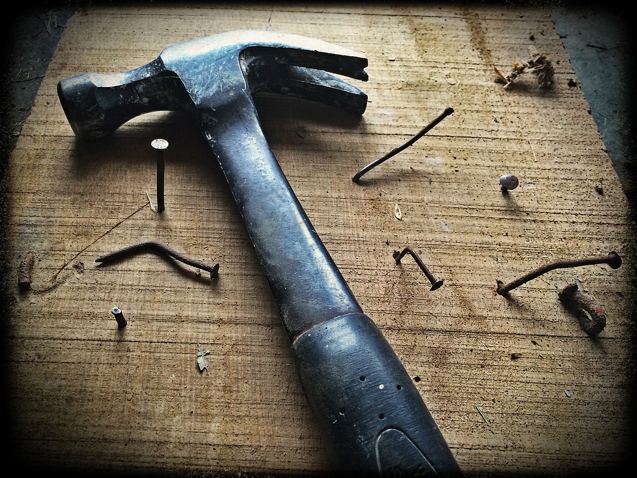
Bottom line: we’re DIY around here. That’s just how it has to be. Sometimes you have to choose between remodeling the kitchen and the bathroom.
I want to thank you for your patience. The changes are not quite done, but they’re close. We’re not ignoring you, we’re just trying to tidy up the place a bit.